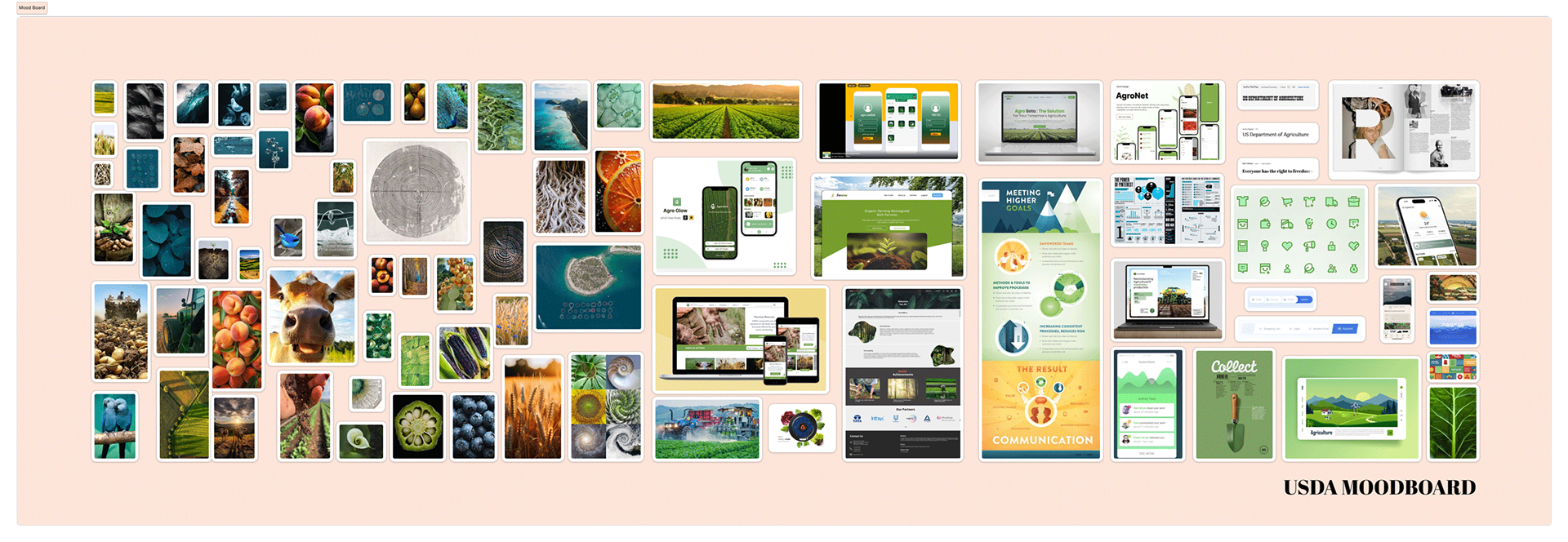
Project mood board created in FigJam
The U.S. Department of Agriculture (USDA) website is a critical national resource serving a diverse audience—from individual farmers to global corporations. As the Lead Product Designer, I spearheaded a comprehensive redesign to transform a functional but fragmented legacy site into a modern, accessible, and intuitive digital experience that honors the department’s scale and importance.
Issues
Despite its wealth of information, the existing platform suffered from several structural and visual failures:
- Navigational Friction: User research revealed significant frustration with excessive click-paths and a confusing form submission process.
- Engagement Loss: Data analysis showed a 10% abandonment rate due to navigational frustration, with 90% of users requiring 5-8 clicks to reach their goal.
- Visual Inconsistency: An outdated aesthetic and a lackluster color palette undermined brand credibility and failed to provide a clear guide for information hierarchy.
Actions Taken
1. User-Centered Research: Conducted comprehensive interviews and card-sorting exercises to restructure the site’s information architecture for efficiency.
2. Iterative Testing: Developed multiple iterations, utilizing A/B testing to optimize accessibility and contrast (selecting a white background with dark text by a 60-40 preference margin).
3. Atomic Design System: Implemented a new design methodology, including a revitalized color palette and a modernized layout, to ensure long-term consistency across the platform.
4. Strategic Layout: Prioritized a high-visibility department directory near the top of the page based on direct user feedback to ensure quick access to popular topics.
Deliverables

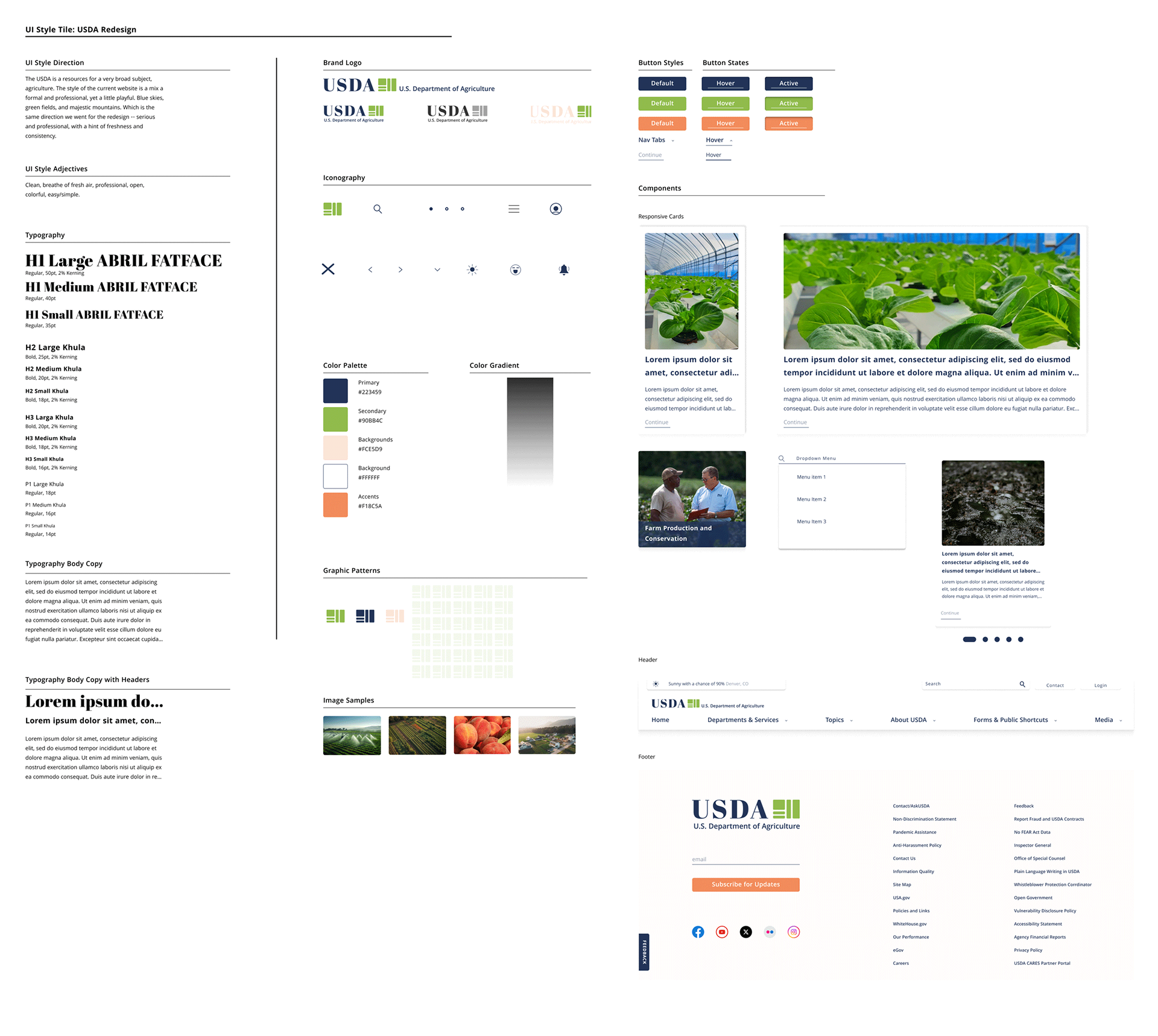
Refreshed design system style card
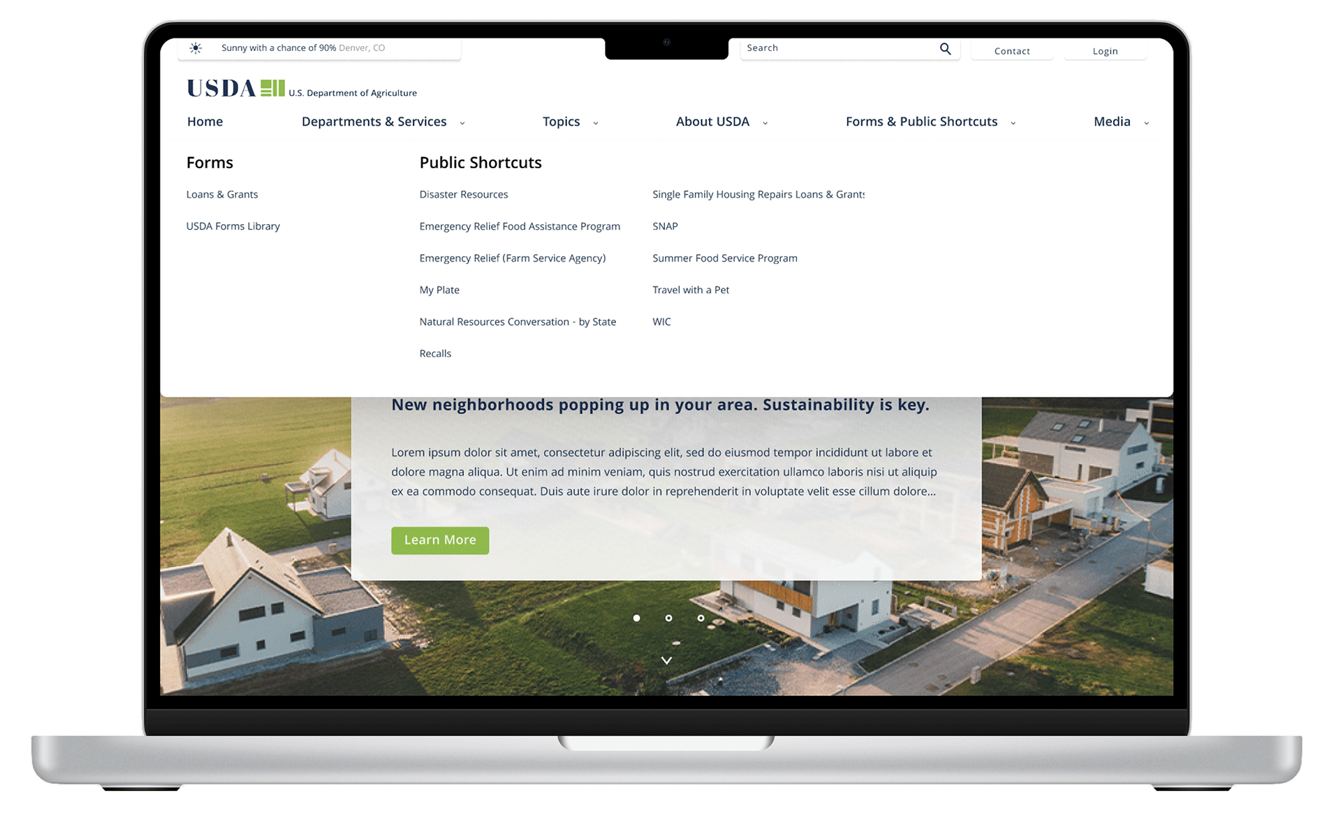
New Navigation based on Information Architectural analysis.